Unity Implementation pt2
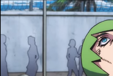
The motive was then the populate the blocked out areas in the museum, so you know, it looks like a museum rather than just a simple gray box area and with the ideas of making it a Transport Museum that was now put into effect. The choices from there were made to add a lot of dynamics to the area. One thing I kept talking about in these blogs was to add people, now I understand the fidelity of ‘people’ in the environment would requite a lot of varying animations to make it seem real, even with that in mind, the people also had to be somewhat not there as well. So with that in mind I took inspiration from an anime called JoJo Bizarre Adventure, where the background characters weren’t entirely defined, they only had the shape of a human and just were a basic gradient colour, which is something I' tried to emulate.
So for the most part I understand that a lot of things had to be added, what was eventually added to the Main Museum progressing from the grey box world, so after much deliberation, I finally managed to make the Level
Final Level Design
To make sure the implementation of the Level fit the original design took quite a bit of time as there were multiple ‘levels’ (talking architecture-wise now) that had to be added, so that means a considerable amount of flat surfaces also had to be put into the level. Also there were a lot of things that finally needed to be added below here is a list of things:
Crowds and their position in the Game World
Textures for the people
The Train next the platform
The Textures for the Station part of the Museum
The Textures for the Walls of the actual Museum
Textures for the Gallery Photos (taken by Jordan Griffith-Brown, with permissions)
Various Spotlight Lighting Nodes
The Tube Train Model
Ambient Sound of the People in the building (recorded by myself during my visit to the London Transport Museum)
And this is how the final result looked like:
Player Perspective
You can see from the In-Game View that the place has livelihood around the area, being that the level has pictures scattered throughout to really give the player the understanding (at least the first impression) that this is a Museum they are going to be entering subconsciously. Additionally the adding of no music and just ambient changes it to something that could seeded in real-life although considering the type of game this is, it makes sense, but if it was an action game, music would be necessary to add that intensity.
Artefact Room Template
Considering the amount of gameplay elements left, I did just consider to make just one game ready for the prototype to display the idea of what this museum was going to be about (and I don’t mean the theme of the place, more what you do). Now I know that the structure I created made sense, so I only decided to really follow through with making one room being the first one. Again from the previous Main Museum implementing the Platforms was easy and had to be accessible from either side so it easy to move around and that the main room has to be open for the player to move around.
A lot of the elements from the previous Museum part would be added here as well but the addition would be a Game artefact that could be interacted with, in this case two wheels to be added on a carriage and positions of UI elements that wouldn’t destroy the layout of screen real-estate even in VR (the sizing had to be sensible for general users). Below is the a top-down view of the area:


