Additional Information (More UI Design)
I knew at this point in time it wouldn’t have been ready or something I could implement into the design before user testing, however, one thing I did understand is that for potential future proofing, how would I make sure users can feel safe and comfortable before and during use, I mean I already had a design theory behind it, but there needs to be UI devices to ensure that the player know what they are doing and how they doing it. Visual feedback, basically.
I knew that entering the museum would need warnings and also the player would have be introduced on how they can interact with the environment, because beside the cognitive knowledge of grabbing things and moving, how would the player have any clue they can switch between movement types for their own comfort?
So with that the idea would be that just before the game starts the player would be introduced with these concepts, by having the whole area being pitch black and just presenting those messages, similarly this would also being the same thing for the control scheme and then once the game has both loaded and the player has read everything it will goin form pitch black and slowly fade into the Museum environment
Additionally, for the player to know when they have switch modes, there will be a simple block stapled to the players vision in the top right hand corner stating the different movement types so the player know which one they are on. This shouldn’t disappear either so the player is continuously conscious which movement type they are currently using, so they can differentiate which buttons/controls are currently disabled.
Onboarding
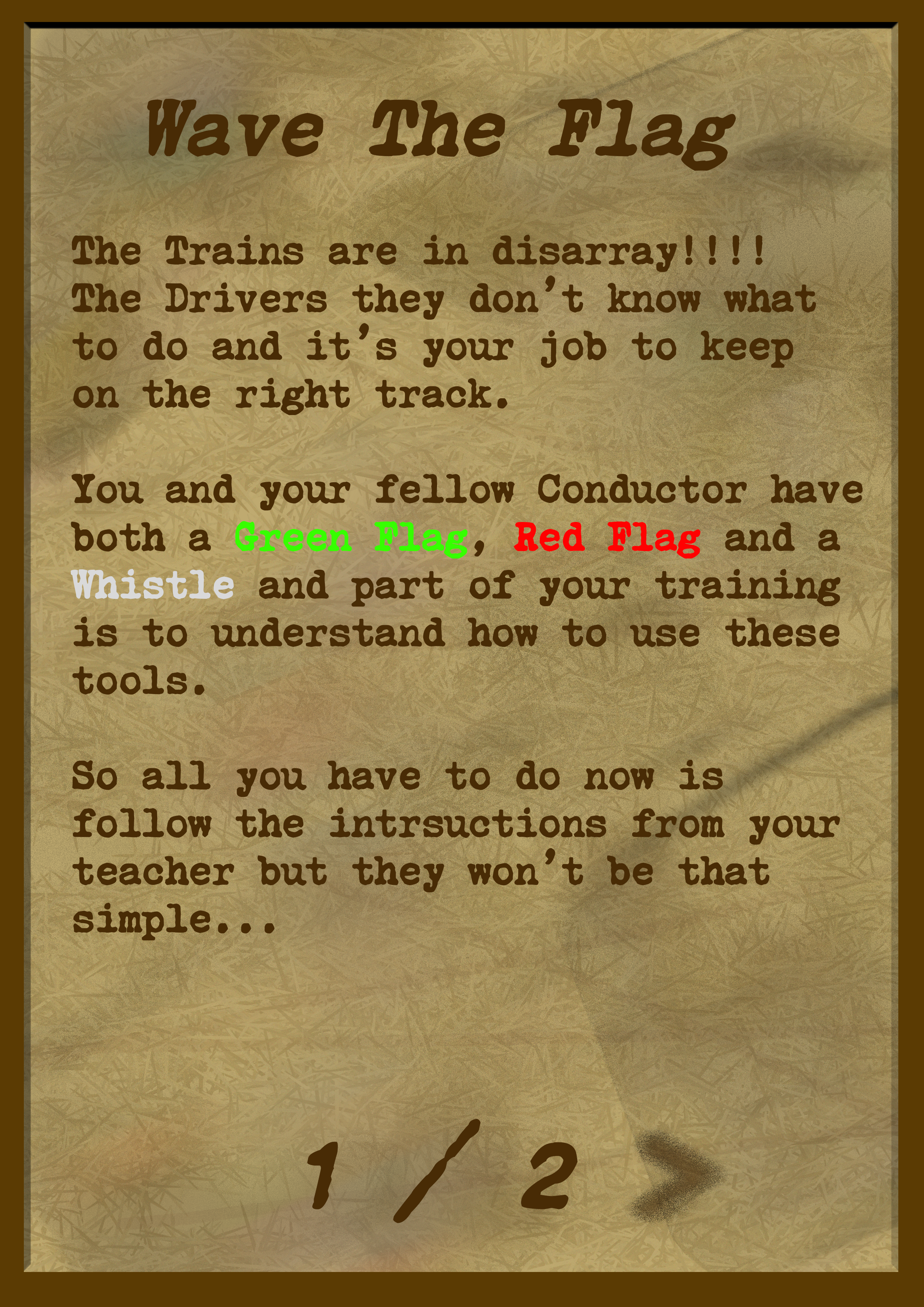
As each of the games have their own set or rules that must be followed, they player could get easily confused, however again the method chosen was to present the player with a base level tutorial to get things started, so as they go through UI text screens which would be floating just below the player to the left-hand side (kind of a floating tablet) the player would be able to click next directly with their hands whenever they want and once you see the Number on the UI text screen, that means a mini-test will start before the actual game so the player would understand the basic mechanics of the game. The player would be locked into finishing that mini-test to ensure they understand the game completely. Although, normally this seems counter-intuitive if player really don’t understand what to do, but the game are simple enough to understand as they use basic human motor control which is learned to us from an early age, so the use of this seem justified.
Additionally, key words have been highlighted for those people who like to skim read, but the words are key to the gameplay in general so the player should then understand what they need to look for, if it isn’t already obvious to them. To suggest an overall improvement to these right now would be to introduce more visual content, but obviously with the games not being implemented, that wouldn’t be possible, but in general something to consider in the future. Down below is a list of all the game and how they player would work through the tutorial/onboarding segments


