User Journey, Level and UI Design
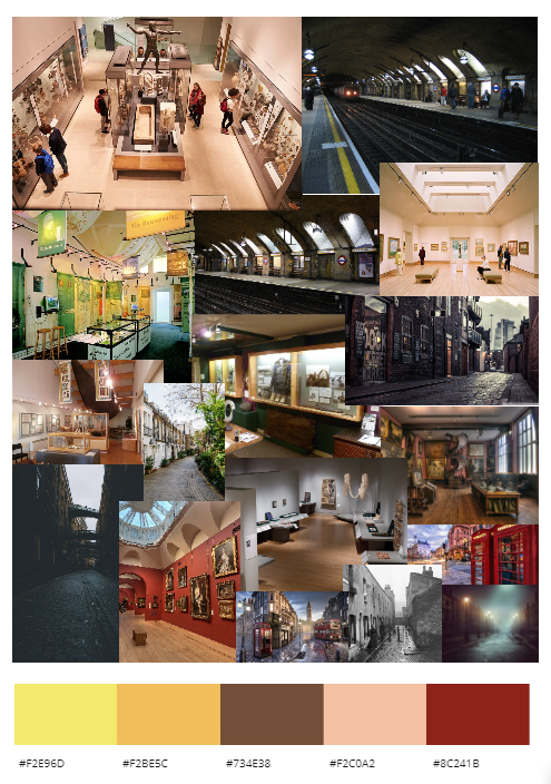
As we already have a understanding the that flow the User has to follow needs to be open to exploration and the theme involves transportation, so the idea would turn into something a little more considerate to that, how about having the player being able to use a transportation system inside the museum, realistically, that would crazy, but this is a virtual museum, so anything is possible. In this case, we would have a museum hub which will have a platform, and then when entering the other rooms, each room with have a platform on both sides, so it makes the player feel as though they can easily leave any room they want to at any time, plus additionally giving the illusion that the museum is massive. Plus the Museum in this case can also enable a whole amount of different rooms for extra content to be added very easily if anything. Following on from that now, I understood that I needed to create a level that incorporates a Tube Station naturally into the space. This is where I would normally start moodboarding so I can get an idea of what I’m looking for.
MoodBoard
With a moodboard created, it made me understand the type of colour scheme, I would be using to create the environment at least believable. I already had to idea to populate the environment which is fine, but I realised the museums offer open spaces and share the common attribute with a station platform, additionally looking at older constructions of tube stations (specifically Baker Street) you can see this bricked worked concave attribute, I don’t know if that was a design choice or actually helps with the aerodynamics of the tube, it left me with the impression to create a dark space with brown, brick-like work, but luminated as much as possible.
However, I also understood, that the mini-games would also be taken place in a multitude of different time periods, so there was the next objective of understanding typography. Now the Hub World would be modern to imply to the player that each game is making them travel to the time period in which these activities (mini-games) took place. So with that in mind the typography and colour schemes would have to change to something old-fashioned or at least feel like that and well now I can make list of those differences, so I made the list and this is how it turned out below:
I did take some time to make some decisions on that front, so for the Modern Museum Hub World and the rooms, the font type would be Ubuntu Regular and for when the player enters a mini-game, the font I chose was Courier Polski 1941, although it is dated 1941, it still looks like it could blend well there. The colour schemes can vary for each game mode though so at least they feel different in comparison as they will be different parts of history
Naming the Games
Finally I wanted to address the name for each of the mini-games, rather than calling them Game 1, Game 2… naming them will make them easier to identify and here is what I came up with:
Game 1 - Race of the Buses
Game 2 - Conductor Control
Game 3 - Steam Struggle
Game 4 - Class Currency Connection
Game 5 - Wave The Flag
Game 6 - Location List
Game 7 - Cruise Control
Game 8 - No Bridge, No Problem


